Hints will display for most wrong answers; explanations for most right answers. You can attempt a question multiple times; it will only be scored correct if you get it right the first time.
I used the official objectives and sample test to construct these questions, but cannot promise that they accurately reflect what’s on the real test. Some of the sample questions were more convoluted than I could bear to write. See terms of use. See the MTEL Practice Test main page to view random questions on a variety of topics or to download paper practice tests.
MTEL General Curriculum Mathematics Practice
Question 1 |
A teacher has a list of all the countries in the world and their populations in March 2012. She is going to have her students use technology to compute the mean and median of the numbers on the list. Which of the following statements is true?
The teacher can be sure that the mean and median will be the same without doing any computation.Hint: Does this make sense? How likely is it that the mean and median of any large data set will be the same? | |
The teacher can be sure that the mean is bigger than the median without doing any computation.Hint: This is a skewed distribution, and very large countries like China and India contribute huge numbers to the mean, but are counted the same as small countries like Luxembourg in the median (the same thing happens w/data on salaries, where a few very high income people tilt the mean -- that's why such data is usually reported as medians). | |
The teacher can be sure that the median is bigger than the mean without doing any computation.Hint: Think about a set of numbers like 1, 2, 3, 4, 10,000 -- how do the mean/median compare? How might that relate to countries of the world? | |
There is no way for the teacher to know the relative size of the mean and median without computing them.Hint: Knowing the shape of the distribution of populations does give us enough info to know the relative size of the mean and median, even without computing them. |
Question 2 |
The histogram below shows the number of pairs of footware owned by a group of college students.
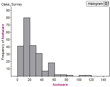
Which of the following statements can be inferred from the graph above?
The median number of pairs of footware owned is between 50 and 60 pairs.Hint: The same number of data points are less than the median as are greater than the median -- but on this histogram, clearly more than half the students own less than 50 pairs of shoes, so the median is less than 50. | |
The mode of the number of pairs of footware owned is 20.Hint: The mode is the most common number of pairs of footwear owned. We can't tell it from this histogram because each bar represents 10 different numbers-- perhaps 8 students each own each number from 10 to 19, but 40 students own exactly 6 pairs of shoes.... or perhaps not.... | |
The mean number of pairs of footware owned is less than the median number of pairs of footware owned.Hint: This is a right skewed distribution, and so the mean is bigger than the median -- the few large values on the right pull up the mean, but have little effect on the median. | |
The median number of pairs of footware owned is between 10 and 20.Hint: There are approximately 230 students represented in this survey, and the 41st through 120th lowest values are between 10 and 20 -- thus the middle value is in that range. |
Question 3 |
The chart below gives percentiles for the number of sit-ups that boys of various ages can do in 60 seconds (source , June 24, 2011)
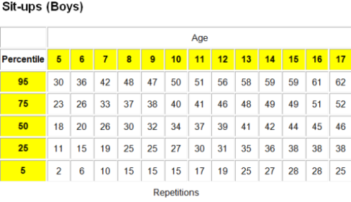
Which of the following statements can be inferred from the above chart?
95% of 12 year old boys can do 56 sit-ups in 60 seconds.Hint: The 95th percentile means that 95% of scores are less than or equal to 56, and 5% are greater than or equal to 56. | |
At most 25% of 7 year old boys can do 19 or more sit-ups in 60 seconds.Hint: The 25th percentile means that 25% of scores are less than or equal to 19, and 75% are greater than or equal to 19. | |
Half of all 13 year old boys can do less than 41 sit-ups in 60 seconds and half can do more than 41 sit-ups in 60 seconds.Hint: Close, but not quite. There's no accounting for boys who can do exactly 41 sit ups. Look at these data: 10, 20, 41, 41, 41, 41, 50, 60, 90. The median is 41, but more than half can do 41 or more. | |
At least 75% of 16 year old boys can only do 51 or fewer sit-ups in 60 seconds.Hint: The "at least" is necessary due to duplicates. Suppose the data were 10, 20, 51, 51. The 75th percentile is 51, but 100% of the boys can only do 51 or fewer situps. |
Question 4 |
The histogram below shows the frequency of a class's scores on a 4 question quiz.
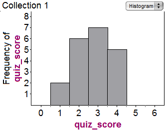
What was the mean score on the quiz?
\( \large 2.75\) Hint: There were 20 students who took the quiz. Total points earned: \(2 \times 1+6 \times 2+ 7\times 3+5 \times 4=55\), and 55/20 = 2.75. | |
\( \large 2\) Hint: How many students are there total? Did you count them all? | |
\( \large 3\) Hint: How many students are there total? Did you count them all? Be sure you're finding the mean, not the median or the mode. | |
\( \large 2.5\) Hint: How many students are there total? Did you count them all? Don't just take the mean of 1, 2, 3, 4 -- you have to weight them properly. |
Question 5 |
The Venn Diagram below gives data on the number of seniors, athletes, and vegetarians in the student body at a college:
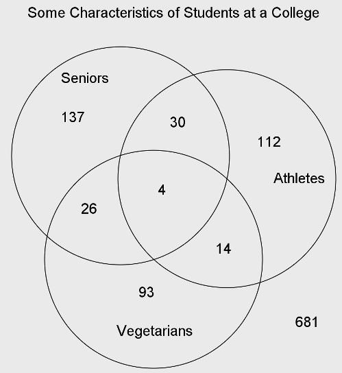
How many students at the college are seniors who are not vegetarians?
\( \large 137\) Hint: Doesn't include the senior athletes who are not vegetarians. | |
\( \large 167\) | |
\( \large 197\) Hint: That's all seniors, including vegetarians. | |
\( \large 279\) Hint: Includes all athletes who are not vegetarians, some of whom are not seniors. |
Question 6 |
The first histogram shows the average life expectancies for women in different countries in Africa in 1998; the second histogram gives similar data for Europe:
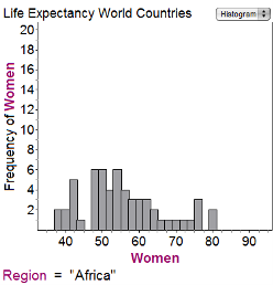
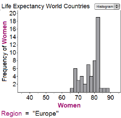
How much bigger is the range of the data for Africa than the range of the data for Europe?
0 yearsHint: Range is the maximum life expectancy minus the minimum life expectancy. | |
12 yearsHint: Are you subtracting frequencies? Range is about values of the data, not frequency. | |
18 yearsHint: It's a little hard to read the graph, but it doesn't matter if you're consistent. It looks like the range for Africa is 80-38= 42 years and for Europe is 88-64 = 24; 42-24=18. | |
42 yearsHint: Read the question more carefully. |
If you found a mistake or have comments on a particular question, please contact me (please copy and paste at least part of the question into the form, as the numbers change depending on how quizzes are displayed). General comments can be left here.